Friday, May 5, 2017

Let Them In

As I was working on this painting, POTUS was attempting to force limits on immigration of fugitives from war in the Middle East.  Like many others, whose citizenship in this country is a result of ancestors fleeing from forced partipation in killing other human beings, I felt that it was important to add my voice and presence to a demonstration at our Capitol.  My intuitive painting process resulted in some human-like figures emerging through the arches that I had created, and the title of the painting announced itself to me.  "Let Them In!"                     

Thursday, January 26, 2017

Vernal Equinox

One of my paintings was chosen for the current exhibit at .Tamarack, the beautiful visitors center that showcases the "Best of West Virginia " arts and crafts.  This exhibit explores the intersection between art and science.  My piece, while abstract, might reflect the Lenten season and the astrological event when day and night are of equal length. 

Saturday, November 7, 2015

WV 2015 Juried Exhibition begins November 8


"Fracking Paradox" was accepted into this Best of West Virginia show beginning November 8 and running through February 19 at Tamarack.  This juried exhibition is sponsored annually by the West Virginia Department of Culture and History and receives hundreds of entries from accomplished artists throughout the State.  Being accepted into this show was one of my long-term goals that I expected to take many tries to accomplish, so I was shocked and thrilled that I made it on my first try!

Although I didn't plan this painting to represent anything, as the textures and colors developed, I was reminded of the controversy over the growing practice of "fracking" to expedite removal of natural gas deposits in the Marcellus Shale region.  This development has been an economic boon to the State, while potentially creating environmental hazards.  Thus, the paradox.

The painting is 36x12 inches on a deep gallery wrapped canvas. Among the textures are cracking paste, foil, Japanese papers, and painted collage papers. Many layers of paint and glaze give more depth to the painting.

A photograph doesn't capture the true colors and all the texture of this painting. If you get a chance to stop at Tamarack as you travel through southern West Virginia, go into the gallery and see it in person!

Thursday, October 29, 2015

Hidden Glories

Currently on exhibit in the gallery at Tamarack is one of my paintings in which I experimented with several acrylic texture mediums on a 30x10 inch piece of art board. As the painting developed, I began to see the geological strata that might be exposed by a huge cut through a West Virginia mountain.  I added some pieces of mica that I had found to add some shine and some collage to represent trees on the mountaintop.

"Hidden Glories" will be available for sale at Gallery Eleven in Charleston after November 1.

Sunday, February 15, 2015

Urban Flow


One-Way Streets
The highlight of the year 2014 for me was being juried in to Tamarack, a showplace for the creative arts, near Beckley, West Virginia. Three of my paintings are on display now through April 6 in the fine art gallery there.  

On the left is a 30x15 inch canvas entitled One-Way Streets, which I started as a collage of papers that had been stamped with hand-carved stamps and arranged to represent a map of the city of Charleston.  A circular stamp in the top center represents the State Capitol building, a series of small squares in the lower center represents Town Center Mall, and other landmarks such as bridges are also represented. Numerous layers of glazes cover the collage, and painted lines represent the maze of one-way streets that often confound visitors to our city.

Also accepted into the "Urban Flow" exhibit were "Don't Look Back"(below) and "Rooftop Series No. 1" which was shown in my last post.


Thursday, January 22, 2015

Winter Art


Being forced to stay indoors does have its benefits:  one has the time to take on-line classes and get the most out of them.  Last winter, I  participated in"Mixed Media Vacation" taught by Julie Prichard. Her video instruction on blending was so helpful that I feel it was worth the price of the class just to watch her paint.

For this class, I used Strathmore Acrylic Paper that was 18 by 24 inches in size.  Although our instructions were to loosely paint or stamp some graphics on our background and then cut up the sheets to make booklets, my first exercise turned into a composition which I couldn't bring myself to cut up.  I went on to do a series, shown below at Gallery Eleven in Charleston. The one above will be included in the "Urban Flow" exhibit in February at Tamarack.


Sunday, December 1, 2013

Featured Artist Exhibit


I am so thankful for having a friend with experience in hanging art exhibits.  I'm sure her good work contributed to the success of the opening.  Below are the monotypes that I displayed as part of my show. They were done with the Gelli Plate. Most of the prints have at least three layers. 


Friday, November 15, 2013

Gallery Show on Sunday

For the past couple of months, I've been frantically getting ready for being the Featured Artist for the month of November at the co-op gallery that I belong to. This Sunday, there will be a reception at Gallery Eleven in Charleston, WV. If you are in the neighborhood, please drop by. See Galleryeleven.com for location and more about the gallery. (I have recently undertaken the job of updating the website also.)

Monday, September 9, 2013

Relief Printmaking at Ghost Ranch, August 2013

Belatedly, I want to write about this year's trip to New Mexico and making my dream come true about spending a week at Ghost Ranch. I had heard of the place as the home of Georgia O'Keeffe, but only in recent years heard about the conference center and classes there from a friend who has taught writing classes there.  She told me about the printmaking class she wanted to take this year, and invited me to go along with her.  Although the Ghost Ranch experience was much more than the class itself, I will stick to writing about the class for this post.

The class was taught by Laura DeLind, an anthropologist and artist at Michigan State University, known for her linocuts.  Her prints are usually in black and white and feature natural objects and whimsical animals.  In this class, we got right down to the business of carving linoleum with Speedball carving tools and printing the result with an oil-based ink on different kinds of paper.  While making the cuts was tedious, that part was easy compared to the actual printing.  Getting a clear and even image without smudging was the hardest part for me.  Here is our class on our last work day with our latest prints hanging up to dry:


Here are the linocuts that I made.  The black in the cut linoleum is the part that was cut away (I couldn't clean out the ink after printing), and the lighter gray is what made the print. In other words, you have to cut the reverse of what you want to print.  If using words, the letters need to be cut backwards.  That's a little tricky when doing fancy letters, as I did in the block on the lower left.  I'll let you guess what it says :)
 And here are two prints that I made.  The first was an exercise to use a border and words.  The second was an exercise of using patterns to define spaces.


The "Ouch" linocut could be used to make a funny "get well" card if a friend has an accident, but I hope I don't have to use it.

More later about the New Mexico trip and Ghost Ranch.


Sunday, September 1, 2013

Recent Paintings

It's been a slow summer, as far as art productivity, but I have completed three paintings since I posted the first of the 24x24 inch canvases that I had purchased.  The Southwest influence has become more obvious in two that I finished and named after my recent trip to New Mexico.

This one, I call "High Road to Taos".  If you have ever been on that road, you will understand why I was thinking of that trip when this appeared on my canvas.  I love that road because it reminds me of a West Virginia two-lane road, but with red rock formations instead of tree-covered mountains.


This year, I was lucky to be in Santa Fe during the Opera Season and splurged on a ticket to see "La Traviata".  What a treat that was!  This painting reflects the brilliant red dress worn by Violetta as well as the turquoise jewelry worn by the opera-goers.  


In my last painting, I deliberately began with a different palette of blues and greens, but ended up with mainly the three primary colors.  As with my other paintings, I started by putting down texture on the canvas, this time using wrinkled tissue paper.  The painting took the shapes of the wrinkles.  I named this one, "Into the Light."   


Thursday, July 11, 2013

Going Large

The largest painting I had done until recently was a  16x20 inch canvas, and that seemed difficult after doing mostly small paintings on watercolor paper.  I worked and re-worked that canvas and was never satisfied with it.  I progressed from watercolor paper to small canvases, but was not ready to take the plunge to purchase a large (and relatively expensive) canvas that I might not be able to finish.

Fortuitously, I stumbled upon a set of three nice canvases at an auction house and got them for $5 each.  They are 24x24 inches in size, 1-1/2 inches deep, and very sturdy.  Photographs were printed on them, but they came off with a scrub of alcohol.  Some gesso, and I was ready to go.  I found that it wasn't scary at all to start painting when I had such a small investment in the canvases.

"Another World" is the first large canvas that I completed.  It is in my current display at Gallery Eleven.  Several people have noted the Southwest influence.  Not surprisingly, I have been inspired by my trips to New Mexico, where I immersed myself in art in the abundant museums and galleries.

Monday, May 20, 2013

Art Walk

Acrylic on watercolor paper, adhered to 8x8 wood panel.
Thursday was my second "Art Walk" since joining Gallery Eleven.  This is a monthly event in downtown Charleston WV where galleries, stores, and offices with art exhibits have "open house" all evening. It is a great social event with music, food and beverages that I have enjoyed in the past as a walker and gawker.  Now that I have work on display at our co-op gallery, I have stayed in that location and talked to visitors.

It is somewhat frightening to have my art on display, as I am still insecure about the quality of my work.  Since it is abstract, the most frequent question that I get is "what does this represent?"

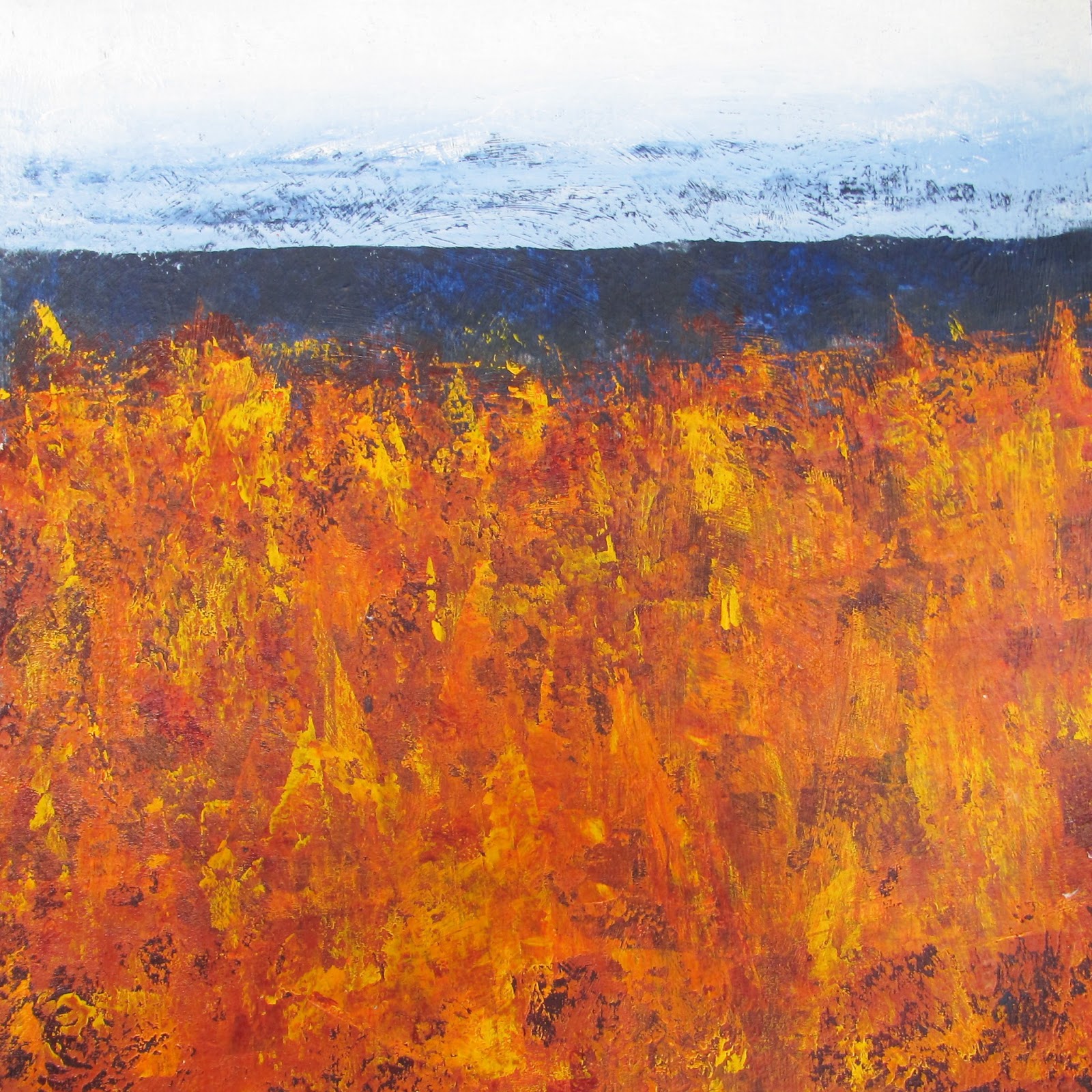
The piece at right got the most second looks and positive comments, and I rather like it myself.  It was part of a class assignment in the Jane Davies "Extreme Composition" class, and was intended to be a color field painting.  I started enhancing the color of the lower section, using a palette knife, and got a texture that became more like a landscape design than was intended for that exercise.  When I hung it at the gallery, I named it "Abstract 4/2013" just to see what folks would say.  Yep!  They asked the same old question. I usually reply, "What does it mean to you?" but would love to have a good "stop 'em cold" answer, which I'm sure many abstract artists have up their sleeves to use on certain occasions.

Monday, April 29, 2013

A new technique! Monoprinting with the Gelli plate

A few weeks ago, I caved in to the urge and bought a Gelli plate.  Having read about it and watched some videos on line, I knew this would be fun and addictive.  And it is!! An hour after my Gelli plate arrived in the mail, I had had run out of space to let them dry, so I made myself quit and drafted this post, which I then forgot to publish.  Since then, I have probably made more than a hundred monoprints on various kinds of paper, including deli paper, which I have added to my stash for collage.

Just a note about the technique, in case you have been out of the country and not heard about it yet :)

The Gelli plate is similar to the kind of gelatin printing plate that is made at home with plain gelatin; however, this one is more permanent - can be used over and over without having to refrigerate.  I've used various kinds of acrylic paint with them and found that student grade acrylic paints work great.  Some acrylic glazing medium helps extend the work time.

Go to Gelliarts for examples, tutorials and purchase.  Art supply companies also carry them.  

Having too much fun to stop and write about it

Fellow bloggers, does this ever happen to you?  I would rather read your blogs than write mine.  How very selfish am I!!  For those who still are following me (or trying to), I will try to do better.  Really.

For the past couple of weeks, I have been enrolled in Jane Davies' Extreme Composition class (on-line).  We started with experimenting with basic shapes and are now working with colors and textures.  Here are some of my experiments:

Squares, Two shapes and a line - ink and tinted charcoal
Background of pan pastels in my sketchbook, with stamping and collage

Acrylic paint and stamping on watercolor paper.
Acrylic paint and gel pens on watercolor paper
Experiments with color and texture - I made a color wheel!!


Tuesday, February 19, 2013

Postcard Project

Artist Jane Davies recently posted on her blog a plea to her followers to help save her small rural post office from closure by sending postcards to her, and thereby, increasing the volume of mail.  She promised to return an art postcard to the first 200 people who responded.  Because I have her book, Collage Journeys, and have admired (and tried to emulate) her art, I jumped right in so that I could receive a piece of her original art.  Several blogs and e-publications have publicized this project, and even school children have taken up this project, so I hope this has benefited the town of Rupert, Vermont.

Subsequently, Jane posted a video tutorial showing how she makes art postcards by creating one art piece (8x12), which she then cuts into 4 postcards..  Following her procedures of randomly painting, collaging, stamping, and doodling, I made one set of postcards so that I could send her additional cards over the next couple of weeks.  That process was such fun, I did two more sets over the weekend.  Here are the three sets I made.  The missing piece has already been mailed off to Jane... I didn't think to take photos before cutting up my large pieces, but you can see where the top two on the left had originally been together.  The set in the middle looked a little bland, so I added ink scribbles after they were cut.

You can read more about Jane's postcard project and see photos of the cards she has received here.  I'm sure we will all benefit by using the U.S. Postal Service more often, so lets get the cards going!!  If you would like to exchange art cards, email me here.

Wednesday, January 30, 2013

In the Groove again!

In November, I saw an invitation to artists to submit work for an exhibit at Gallery Eleven, an art cooperative in my home town.  All pieces had to be in an 8 by 8 inch format, and I just happened to have the one that I did in a workshop last July with Toni Kelly.  I had been thinking of doing a companion piece, so this gave me the nudge I needed to start painting again.  On these first two pieces, I used scanned copies of drawings from my nature journal and quotations on the themes of Hope and Joy.


This was so much fun that I did two more pieces to enter in the show.  I didn't have any more birdie drawings that lent themselves to something similar, so the next two pieces were more abstract.  My favorite way to start a painting is to lay down some texture with tissue or molding paste and then see where that takes me.  These are the results:


The exhibit opened on January 12, and a few days later, I got a call saying that one of my pieces had sold!  It was the very bright abstract in my favorite colors of red, orange, pink and turquoise, which I had named "Alive!"  I was thrilled and feeling validated as an artist.

Now I have a couple more abstracts nearly finished and am just bubbling over with the urge to paint every day.  It feels so good to be back in the groove!!

Saturday, October 20, 2012

New Mexico Vacation Journal

This year's vacation was a long time in planning and was a dream come true.  With some good companions, I was able to explore Santa Fe, Taos, and Albuquerque without the time constraints of past trips.  The day we spent touring Georgia O'Keeffe's home and studio in Abiquiu, shopping at Bode's General Store, and taking in the scenery around Abiquiu was one of the highlights of the week.  The mountain scenery on the "High Road" from Santa Fe to Taos was awesome, and the late afternoon return trip via the Low Road was just as memorable for the sight of the Rio Grande valley with its golden cottonwood trees.

About a week before my departure for New Mexico, I stumbled upon two treasures in my favorite local antique store. One was an old tin watercolor paint palette, which I was delighted to find to make a travel palette. I removed the original paint pans, which were very rusty, and buffed out the rusty spots in the cover and mixing pan so that they wouldn't contaminate new paint. Then I glued in empty pans and filled them with my favorite colors. I was tickled that I could get a combination of 21 half and whole pans to fit exactly in the palette space.

The second treasure was an old book called "The Pony Boy Riders in New Mexico".  The book is one of a series, somewhat like the more famous Hardy Boys, except these tell the adventures of some schoolboys who spend their summers with their guardian exploring the West.  Although I haven't read the entire book, the gist of this story seems to relate to getting mixed up in some battles between Mexicans and Indians.

Although I am usually reluctant to damage or destroy any old book that would have any value as a collector's item, the pages are brown, very dry and coming loose from the binding.  Also, I found the treatment of the Native Americans in the book to be offensive and thought that using what is left of the book in my art would be a better use than preserving the story.

My first thought was to use the pages as a basis for journal page backgrounds, especially since the odd-numbered sides of the pages were titled "In New Mexico" at the top.  I pulled out a couple of pages from the back of the book and experimented with that, but found that the pages didn't hold up very well on their own, so I had to glue them down to a substrate page before working with them.  I then used some tinted and thinned gesso to cover most of the words, leaving just "In New Mexico" clearly visible.  I also used stamps and copies of maps to decorate some of the pages in advance.

The book's cover was in excellent shape and I decided it would be fun to use it for the journal cover.  I cut down the center of the back binding and reinforced the edges before using my "Bind-it-All" machine to punch for the spiral binding.


My friends who joined me on the trip got a chuckle out of naming ourselves "The Pony Girls."  They made sure that I wrote each day about the highlights of our trip.  I also made a couple of watercolor sketches on the watercolor paper I had bound in the back of the journal.  When I returned, I inserted photos in the blank spaces to complete the book.


I know this journal will be a lasting keepsake of one of the best weeks of my life.


Tuesday, September 11, 2012

New Mix in my Media

As I'm planning another trip to New Mexico this fall, I thought about the fun places to shop and remembered the wonderful fabrics that I brought back last time.  How can I buy more this time if I haven't touched those??? (Well, I sure could, but I shouldn't!!)  Anyway, I decided it was time to haul out the sewing machine, which also hadn't been touched since I bought it a couple of years ago, and do a project.   I was shocked to find out that the machine worked perfectly, and I didn't struggle to get the tension right or have any of the frustrations I expected from my past experience with sewing machines.  Why did I put this off so long??

Here's what I made:  a slipcover for my Moleskine sketchbook.  I sewed down some pieces of fabric on a backing of plain cotton duck, using machine decorative stitching.  Some of the fabrics have printed on stitching, so it's hard to tell from the photo which stitches are which.

After putting in a lining and closing the ends, I sewed on a button and looped on a ribbon for the closure.


This is what the outside looks like, including the back.


And here's the inside lining and pockets that hold the book. 
Purrkins likes the ribbons.

Thursday, August 16, 2012

Mixing Greens

I've started following the wonderful art blog of Susan Bronsak (see it here) and love to see her ideas for working with watercolors.  One of her posts showed how she made color charts by making images for each color rather than just making a square or blob of color, as I have always done.  Since I have recently purchased some new watercolor paints from Daniel Smith, I decided to do a page of green samples as Susan did.  Although I can't paint trees nearly as well as she does, I enjoyed doing my samples this way and taking a little time to choose a tree that might require the shade I was mixing.

The four green paints that I currently have are:  Winsor Green (Winsor Newton), Hookers Green (Liquitex) and Sap Green (Daniel Smith) and Diopside (Daniel Smith).  First I did a tree in the green alone, then mixed each with Zoisite (Daniel Smith) and again with Burnt Sienna (Daniel Smith).

Just a note about Zoisite:  it's my favorite mixing color for doing nature sketches.  It is a granulating dark greenish gray that tones down bright colors, gives them texture, and makes them look more natural, in my opinion.  I've used it mostly on ocean and sky landscapes, but love what it does to the greens. It's from the Daniel Smith Primatek series, which are made from mined earth minerals.

My next step will be to do a page of blue and yellow mixes.  So many greens, so little time...

Thursday, August 9, 2012

Handmade Journals

One of my favorite things to do is create painted papers for backgrounds and other uses.  Over the past week, I've been adding acrylic paint layers to a 12x12 piece of watercolor paper.  In addition to making marks in the base coat of gesso, I created texture on this piece with molding paste through a stencil.  Both sides of the paper are painted because it was my intent to use the finished paper to make covers for a journal.

Planning ahead for an art trip this Fall, I wanted a fresh watercolor journal ready to go.  I have made several handmade journals in the past and prefer them to the "boughten" kind.  I can use my favorite papers, choose any size I want, and have fun with the process!!

In this new journal, I put a mix of papers -  Arches cold press #140 lb., some Rives BFK, and some Stonehenge sketching paper.  One 22x30 sheet can be torn into 16 sheets that are approximately 5 x 7.5 inches, which about the usual size of a purchased journal.  This journal has a total of 36 sheets.


I like spiral binding because it allows the journal to lie flat, so I use the "Bind-it-all" machine. Although the purchase of that gadget seemed rather expensive at the time, even with a discount coupon, it has nearly paid for itself.  I've made several journals and notebooks for myself and as gifts and have even sold a couple of them.  At right are the ones I'm currently using - a large (8x10) nature journal, a small pocket notebook, and two watercolor journals.

Another plus to binding your own journals is that you can take them apart, take pages out, change the order, or put more pages in and then re-bind them.  No more anxiety about messing up an art journal!  Yay!